Machine Learning for Hackers Chapter 2, Part 1: Summary stats and density estimators
Chapter 2 of MLFH summarizes techniques for exploring your data: determining data types, computing quantiles and other summary statistics, and plotting simple exploratory graphics. I’m not going to replicate it in its entirety; I’m just going to hit some of the more involved or interesting parts. The IPython notebook I created for this chapter, which lives here, contains more code than I’ll present on the blog.
This part’s highlights:
- Pandas objects, as we’ve seen before, have methods that provide simple summary statistics.
- The plotting methods in Pandas let you pass parameters to the Matplotlib functions they call. I’ll use this feature to mess around with histogram bins.
- The
gaussian_kde(kernel density estimator) function inscipy.stats.kdeprovides density estimates similar to R’sdensityfunction for Gaussian kernels. Thekdensityfunction, instatsmodels.nonparametric.kdeprovides that and other kernels, but given the state ofstatsmodels‘ documentation, you would probably only find this function by accident. It’s also substantially slower thangaussian_kdeon large data. *[Not quite so! See update at the end.]
Height and weight data
The data analyzed in this chapter are the sexes, heights and weights, of
10,000 people. The raw file is a CSV that I import using read_table in Pandas:
heights_weights =
read_table('data/01_heights_weights_genders.csv', sep = ',', header = 0)
Inspecting the data with head,
print heights_weights.head(10)
gives us:
 Gender    Height     Weight
0  Male 73.847017 241.893563
1  Male 68.781904 162.310473
2  Male 74.110105 212.740856
3  Male 71.730978 220.042470
4  Male 69.881796 206.349801
5  Male 67.253016 152.212156
6  Male 68.785081 183.927889
7  Male 68.348516 167.971110
8  Male 67.018950 175.929440
9  Male 63.456494 156.399676
So it looks like heights are in inches, and weights are in pounds. It also looks like the dataset is evenly split between men and women, since
heights_weights.groupby('Gender')['Gender'].count()
results in:
Gender
Female 5000
Male 5000
The data are simple, clean, and appear to have imported correctly. So, we can start looking at some simple summaries.
Numeric summaries, especially quantiles
The first part of Chapter 2 covers the basic summary statistics: means, medians, variances, and quantiles. The authors hand-roll the mean, median, and variance functions to see how each is calculated. All of these methods are available as methods to Pandas series, or as NumPy functions (which are typically what’s called by equivalent Pandas methods).
The describe method of Pandas series and data frames, which we saw in
Part 3 of Chapter 1, gives summary statistics. The summary stats for
the height variable are:
heights = heights_weights['Height']
heights.describe()

count 10000.000000
mean 66.367560
std 3.847528
min 54.263133
25% 63.505620
50% 66.318070
75% 69.174262
max 78.998742
The heights all lay within a reasonable range, with no apparent outliers
from bad data. The default quantile range in describe is 50%, so we
get the 75th and 25th percentiles. This can be changed with the
percentile_width argument; for example, percentile_width = 90 would
give the 95th and 5th percentiles.
There doesn’t seem to be a direct analog to R’s range function, which
calculates the difference between the maximum and minimum value of a
vector, nor for the quantile, which can calculate the quantiles at any
given a series of probabilities. These are easy enough to replicate though.
Note: Nathaniel Smith, in comments, points out that R’s
rangefunction doesn’t do this either, but just returns the min and max of a vector. There is a function for this in NumPy, though: themy_rangefunction below gives the same result as wouldnp.ptp(heights.values).ptpis the “peak-to-peak” (min-to-max) function.
Range is trivial:
def my_range(s):
'''
Difference between the max and min of an array or Series
'''
return s.max() - s.min()
Calling this, we get a range of 78.99 − 54.26 = 24.63 inches.
Next, a quantiles function to mimic R’s. We can just make a wrapper
around the quantile method, mapping it along a sequence of provided probabilities.
def my_quantiles(s, prob = (0.0, 0.25, 0.5, 1.0)):
'''
Calculate quantiles of a series.

Parameters:
-----------
s : a pandas Series
prob : a tuple (or other iterable) of probabilities at
which to compute quantiles. Must be an iterable,
even for a single probability (e.g. prob = (0.50,)
not prob = 0.50).

Returns:
--------
A pandas series with the probabilities as an index.
'''
q = [s.quantile(p) for p in prob]
return Series(q, index = prob)
Note that the default argument gives quartiles. We can get deciles by calling:
print my_quantiles(heights, prob = arange(0, 1.1, 0.1))
which spits out:
0.0 54.263133
0.1 61.412701
0.2 62.859007
0.3 64.072407
0.4 65.194221
0.5 66.318070
0.6 67.435374
0.7 68.558072
0.8 69.811620
0.9 71.472149
1.0 78.998742
Note: the
quantilesfunction I’ve written is a little awkward when dealing with a single quantile. Because the list comprehension that computes the qunatiles requires that theprobargument be an iterable, you would have to pass a list, tuple, array or other iterable with a single value. You can’t just pass it a float. I’ve hit this issue a few times writing Python functions–where it’s difficult to make code robust to both iterable and singleton arguments. If anyone has tips on this (should I really be doing type checking?), I’d be thrilled to hear them.
Histograms
Next the authors mess around with histograms and density plots to explore the distribution of the data. Noting that different bin sizes for histograms can affect how we perceive the data’s distribution, they plot histograms for a few different bin widths.
In Matplotlib, bins are not specified by their width, as is possible ggplot. We can either give Matplotlib the number of bins we want it to plot, or specify the actual bin-edge locations. It’s not difficult to translate a desired bin width into either one of these types of argument. I’ll provide the sequence of bins.
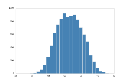
First, 1-inch bins:
bins1 = np.arange(heights.min(), heights.max(), 1.0)
heights.hist(bins = bins1, fc = 'steelblue')
Note how I’m using the Pandas hist method, which, using a **kwargs
argument, can pass parameters to the Matplotlib plotting functions.
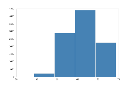
Next, 5-inch bins:
bins5 = np.arange(heights.min(), heights.max(), 5.)
heights.hist(bins = bins5, fc = 'steelblue')
And finally, 0.001-inch bins:
bins001 = np.arange(heights.min(), heights.max(), .001)
heights.hist(bins = bins001, fc = 'steelblue')
plt.savefig('height_hist_bins001.png')
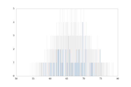
These all match the figures in the book, so I’m probably doing it right.
Kernel density estimators in SciPy and statsmodels
R’s density function computes kernel density estimates. The default
kernel is Gaussian, but you can also use Epanechnikov, rectangular,
triangular, biweight, cosine kernels.
In Python, it looks like you have two options for kernel density. The
first is gaussian_kde from the scipy.stats.kde module. This provides
a Gaussian kernel density estimate only. The other is kdensity in the
statsmodels.nonparametric.kde module, which provides alternative
kernels similar to R.
I actually wasn’t aware of the kdensity function for a while, until I
stumbled upon a mention of it on a mailing list archive. I couldn’t find
it in the statsmodels documentation. Statsmodels, generally, seems
to have a lot of undocumented functionality; not surprising for a young,
rapidly-expanding project.
Playing with both functions, I found some pros and cons for each.
Obviously kdensity provides an option of kernels, whereas
gaussian_kde does not. kdensity also generates simpler output than
gaussian_kde. kdensity provides a tuple of two arrays–the grid of
points at which the density was estimated, and the estimated density of
those points. gaussian_kde provides an object that you have to
evaluate on a set of points to get an array of estimated densities. So
essentially, you’re calling it twice, and I don’t see much point to that redundancy.
On the other hand kdensity gets much slower than gaussian_kde as
the number of points increases. For the 10,000 points in the = heights
array, gaussian_kde took about 3.3 seconds to output the array of
estimated densities. kdensity wasn’t finished after several minutes. I
haven’t looked carefully at the source code of the two functions, but I
assume kdensity‘s problem is that at some point it creates a temporary
NxN array, which for N = 10,000 is going to gum things up. Setting
the gridsize argument in kdensity to something even as large as
5000, cuts the size of the temporary array in half, and reduces the
running time to about 3 seconds.
This is probably worth exploring in a future post. In the meantime, I’m
going stick with gaussian_kde and plot some densities.
Note: See the update below. I’ve
updated the IPython notebook for this chapter to use Statsmodels’
KDE class instead of SciPy.]
First, heights:
density = kde.gaussian_kde(heights.values)

fig = plt.figure()
plt.plot(np.sort(heights.values),
density(np.sort(heights.values)))
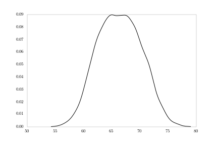
The sorting of the heights array is to make the lines connect nicely.
Otherwise, the lines will connect from point-to-point in the order they
occur in the array; we want the density curve to connect points left-to-right.
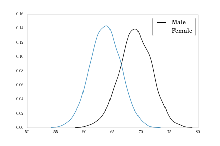
Notice the slight bi-modality in the figure. What we’re likely seeing is a mixture of male and female distributions. We can plot those separately.
# Pull out male and female heights as arrays over which to compute densities
heights_m = heights[heights_weights['Gender'] == 'Male'].values
heights_f = heights[heights_weights['Gender'] == 'Female'].values
density_m = kde.gaussian_kde(heights_m)
density_f = kde.gaussian_kde(heights_f)

fig = plt.figure()
plt.plot(np.sort(heights_m), density_m(np.sort(heights_m)), label = 'Male')
plt.plot(np.sort(heights_f), density_f(np.sort(heights_f)), label = 'Female')
plt.legend()
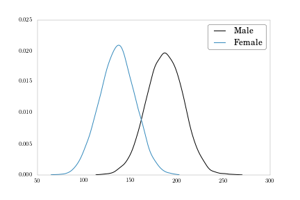
We also have a weight variable we can plot.
weights_m = heights_weights[heights_weights['Gender'] == 'Male']['Weight'].values
weights_f = heights_weights[heights_weights['Gender'] == 'Female']['Weight'].values
density_m = kde.gaussian_kde(weights_m)
density_f = kde.gaussian_kde(weights_f)

fig = plt.figure()
plt.plot(np.sort(weights_m), density_m(np.sort(weights_m)), label = 'Male')
plt.plot(np.sort(weights_f), density_f(np.sort(weights_f)), label = 'Female')
plt.legend()
To finish up, let’s move each density plot to its own subplot, to match Figure 2-11 on page 51.
fig, axes = plt.subplots(nrows = 2, ncols = 1, sharex = True, figsize = (9, 6))
plt.subplots_adjust(hspace = 0.1)
axes[0].plot(np.sort(weights_f), density_f(np.sort(weights_f)),
label = 'Female')
axes[0].xaxis.tick_top()
axes[0].legend()
axes[1].plot(np.sort(weights_m), density_m(np.sort(weights_m)),
label = 'Male')
axes[1].legend()

Here I’m using the subplots function, same as in Part 5 of Chapter
1, and sharing the x-axis to make clear the difference between the
distributions’ central tendencies.
Conclusion
I’ll wrap up Chapter 2 in the next post, where I’ll look at lowess smoothing in Statsmodels, and get a little taste of logistic regression.
Update!
Statsmodels honcho skipper seabold sets me straight in the comments.
While the kdensity function is slow, statsmodels has an implementation
which uses Fast Fourier Transforms for Gaussian kernels and is
substantially faster than Scipy’s gaussian_kde.
For the heights array:
# Create a KDE object
heights_kde = sm.nonparametric.kde.KDE(heights.values)

# Estimate the density by fitting the object (default Gaussian kernel via FFT)
heights_kde.fit()
We can then plot this vector of estimated densities,
heights_kde.density against the points in heights_kde.support.
I’ve updated the IPython notebook for this chapter to use Statsmodels’ KDE throughout, so check it out for more detail.
Comments