Machine Learning for Hackers Chapter 1, Part 3: Simple summaries and plots.
Introduction
See Part 1 and Part 2 for previous work.
In this part, I’ll replicate the authors’ exploration of the UFO sighting dates via histograms. The key takeaways:
- The plotting methods in Pandas are easy and useful.
- Unlike R
Dates, Pythondatetimesaren’t compatible with a lot of mathematical operations. We’ll see that you can’t apply quantile or histogram methods to them directly.
Quick data summary methods and datetime complications.
For those playing along at home, I’m at p. 19 of the book. The first
thing the authors do here is get a statistical summary of the sighting
dates in the data, which are recorded in the DateOccurred variable
(which I’ve named date_occurred in my code). This is easy in R using
the summary function, which provides the minimum, maximum, and
quartiles of the data by default.
Pandas has similar functionality, in a method called describe, which
gives the same for numeric variables, plus the count of non-null values
and the mean and standard deviation. For example:
s1 = Series(np.random.randn(100))
print s1.describe()
outputs what we’d expect from a series of randomly-generated standard normals:
count 100.000000
mean -0.149274
std 1.011230
min -2.521374
25% -0.790867
50% -0.167813
75% 0.596617
max 2.231157
If we apply this to the date_occurred series, though, we get something different.
ufo_us['date_occurred'].describe()[/sourcecode]
results in:
count 52134
unique 8786
top 1999-11-16 00:00:00
freq 185
because Pandas treats datetime series as non-numeric variables (which
they technically are).
Note: To compute quantiles for numeric series, Pandas uses SciPy’s
scoreatpercentilefunction, which in turn relies on a simple linear interpolation function (_interpolateinscipy.stats).datetimeobjects don’t play well with this function, since when you take the difference between twodatetimesyou don’t get a number, but instead atimedeltatuple, that you can’t perform mathematical operations on until you unpack it. Theminandmaxmethods will work ondatetimes, though.
We can get around this by extracting the years from the variable, which will be integers.
years = ufo_us['date_occurred'].map(lambda x: x.year)
print years.describe()
results in:
count 52134.000000
mean 2000.572237
std 10.889045
min 1400.000000
25% 1999.000000
50% 2003.000000
75% 2007.000000
max 2010.000000
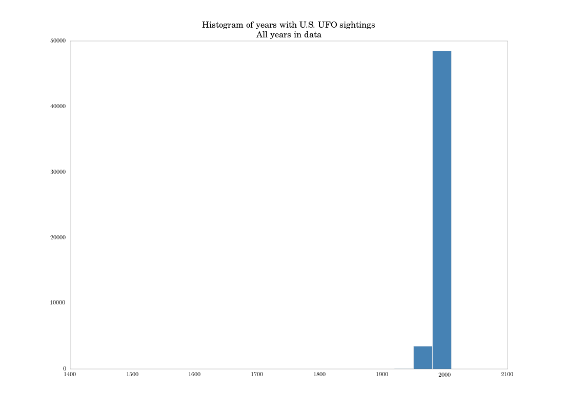
which is a little precise for year data, but how is Pandas to know? At any rate, we come to the same conclusion as the authors: that three quarters of the sightings occurred in 1999 or later, and the earliest date in the data is in 1400. (If we check, we’ll see this sighting occurred in Texas, so it’s certainly an error).
Plotting histograms
The authors then plot a histogram of the dates in the data. Like with
quantile, the hist plot method (which just calls a Matplotlib
histogram) doesn’t work with datetime data. If we try
ufo_us['date_occurred'].hist()
we’ll get an error complaining that datetime can’t be compared with
float. So, I’ll just work with the years instead of the full
datetime. I can generate the plot with a call to the series’ hist
method, one of several plotting methods for Pandas objects that makes it
extremely easy to get quick plots of them.
plt.figure()
years.hist(bins = (years.max() - years.min())/30., fc = 'steelblue')
plt.title('Histogram of years with U.S. UFO sightings\nAll years in data')
plt.savefig('quick_hist_all_years.png')
I explicitly set the bins to match the ggplot defaults used in the book. We get this plot, which basically matches the authors’:
The authors then focus on only data after 1990, using R’s subset
function to remove earlier observations from the data. This is
straightforward in Pandas. I’ll also extract another series with the
years of this subset of dates.
ufo_us = ufo_us[ufo_us['date_occurred'] \>= dt.datetime(1990, 1, 1)]
years_post90 = ufo_us['date_occurred'].map(lambda x: x.year)
After subsetting, the authors have 46,347 rows left in the data. Looking
at the shape attribute of the subsetted data frame, we have 46,780.
We’ve picked up some observations from D.C., as well as from our more
expansive method of finding U.S. locations.
Another histogram of the subset data looks similar to the authors’ chart on p. 23, but since I’m only histogramming over years, I lose some resolution.
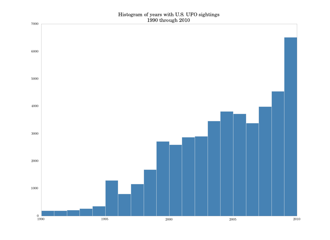
While the histogram is fine for a quick look at the distribution of
dates, it’s not a very accurate picture of how sightings evolve over
time: the binning really destroys too much information. It makes more
sense just to do a time-series plot of total sightings by date. We can
do that with some data aggregation and an easy call to the plot method
in Pandas.
post90_count = ufo_us.groupby('date_occurred')['date_occurred'].count()
plt.figure()
post90_count.plot()
plt.title('Number of U.S. UFO sightings\\nJanuary 1990 through August 2010')
plt.savefig('post90_count_ts.png')
This uses Pandas’ awesome groupby method, which I’ll discuss more in
the next part. We get the following figure:
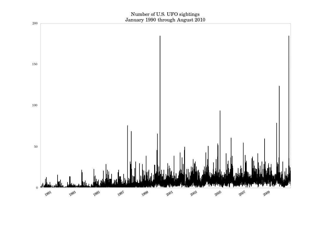
Based on this graph, it looks like there’s a seasonal component to sightings, which wasn’t apparent in the histogram. There are also a few large spikes, especially around the end of the millenium.
Conclusion
This part was a relatively easy one. The next part will focus on data
aggregation using groupby and reindex methods. Then I’ll wrap up
with with replicating the authors’ trellis graph.
Comments