Better typography for IPython notebooks
(Warning: ignorant rant coming up)
Like everyone else who’s ever used it, I love the IPython notebook. It’s not only an awesomely productive environment to work in, it’s also the most powerful weapon in the Python evangelist’s arsenal (suck it, Matlab).
I also think it’s not hard to imagine a world where scientific papers are all just literate programs. And the notebook is probably one of the best tools for literate programming around in any language. The intregration of markdown and LaTeX/MathJax into the notebook is just fantastic.
But it does have one weakness as a literate programming tool. The default typography is ugly as sin.
There are several issues, but two major ones are easily fixable.
Long lines
By far the biggest issue is that the text and input cells extend to 100% of the window width. Most people keep their browser windows open wider than is comfortable reading width, so you end up with long hard-to-read lines of text in the markdown cells.
And for the code, it would be nice to have the code cell discourage you from long lines. The variable width cells don’t. I’m an 80-character anal retentive, and even I have trouble in the notebook getting a sense of when a line is too long.
When you write a script in a text editor, there’s lots of previous code in the viewable window, so your eye gets a sense of the ‘right-margin’ of the code. (Not to mention many editors will indicate the 80- or whatever-character column, so you know exactly when to break). But in the notebook, your code is typically broken up into smaller blocks, and those blocks are interspersed with output and other cells. It’s hard to get a visual sense of the right margin.
Ugly fonts
Text and markdown cells are typically rendered in Helvetica or Arial. Helvetica is a fine font, obviously, but it’s not really suitable for paragraphs of text (how many books, magazines, newspapers, or academic papers do you see with body text typeset in Helvetica?). And combined with the small size and long lines makes it hard to read and just plain ugly. I don’t think I have to say anything about Arial.
The way I use the notebook—with markdown cells used for long stretches of explanatory text and result interpretation—it’s better to have the text cells render in a serif font. This way it stands out from the code and output cells more. Serif fonts also have more distinctive italics, and integrate better with LaTeX/MathJax math.
Code cells and interpreter output cells render in whatever your default monospace font is. That’s typically Courier or Courier New. This is fine, but really, this is the 21st century—we can do a lot better.
Update: one more thing
I realize I’ve made one other change that I think is important. The
default ordered list in the notebook uses roman numerals (I, II, III,
…). I almost always want arabic numerals (1, 2, 3, …) instead. We
can change this in the file renderedhtml.css with
.rendered_html ol {list-style:decimal; margin: 1em 2em;}
(Also check the comments for other, and typically better ways to make
changes.) You can also modify sub-levels ol ol, ol ol ol, etc.
Ideally I’d like to have nested numbers 1.1, 1.1.1, but this isn’t
straightforward so I haven’t implemented it. If anyone has tips, I’d be
thrilled to hear them.
Fixing it (locally, at least)
(Warning: I don’t know what I’m doing. Don’t make any of these changes, or any others, without backing up the files first.)
(Update: Matthias Bussonnier has an informative post showing the right way to make these changes. If you make the CSS changes I describe below, do it the way he advises, not through the files I describe here.)
The notebook is served through the browser, so its frontend is basically
just HTML, Javascript, and CSS. The typography and appearance of the
notebook is nearly all driven by CSS files located where IPython is
stored on your system. This will differ based on your OS and your Python
distribution. On my mac, with the AnacondaCE distribution, the
stylesheets are located
in /Users/cvogel/anaconda/lib/python2.7/site-packages/IPython/frontend/html/notebook/static.
There are several subfolders there, including one called /css and
/codemirror. You can also take a look at the stylesheet files by
firing up a notebook, and using your browser’s inspector. If your
browser (e.g. Chrome) lets you edit stylesheets on the fly in the
inspector, you can try out changes relatively safely.
Here are the edits I’ve made on my system to address the issues above. First, in the /css folder, in the file called notebook.css
1. Set code input cells to be narrower (code that runs past the width will be invisible). I try to set this for about 80 characters plus some buffer. There’s not way to set width as number of characters in CSS, so you may have to experiment to see what ex-widths works with your font.
div.input {
width: 105ex; /* about 80 chars + buffer */
...
}
2. Fixing markdown/text cells. I make changes to the font, width, and linespacing. I’m using Charis SIL, a font based on the classic Bitstream Charter, and freely available here. Shortening the lines and adding some line space (120% to 150% of point size is usually a good range) for legibility.
div.text_cell {
width: 105ex /* instead of 100%, */
...
}

div.text_cell_render {
/*font-family: "Helvetica Neue", Arial, Helvetica, Geneva, sans-serif;*/
font-family: "Charis SIL", serif; /* Make non-code text serif. */
line-height: 145%; /* added for some line spacing of text. */
width: 105ex; /* instead of 'inherit' for shorter lines */
...
}
3. Add styles to specify sizes for headers.
/* Set the size of the headers */
div.text_cell_render h1 {
font-size: 18pt;
}

div.text_cell_render h2 {
font-size: 14pt;
}
Then, in the `/codemirror/lib subfolder, there’s a file called codemirror.css. In here we can change the font used for code, both input and interpreter output. I’m using Consolas.
.CodeMirror {
font-family: Consolas, monospace;
}
Obviously these changes only affect notebooks you view on your local machine, and whoever views your notebooks on their own machine, or on nbviewer will see the default style.
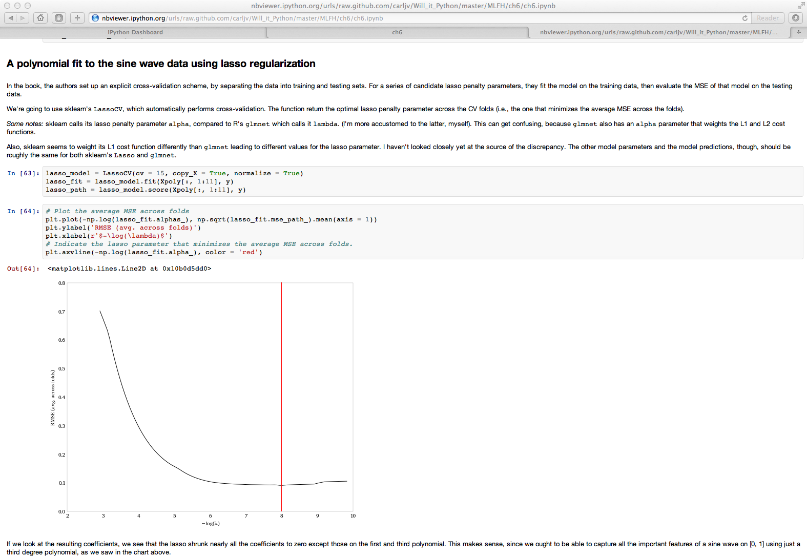
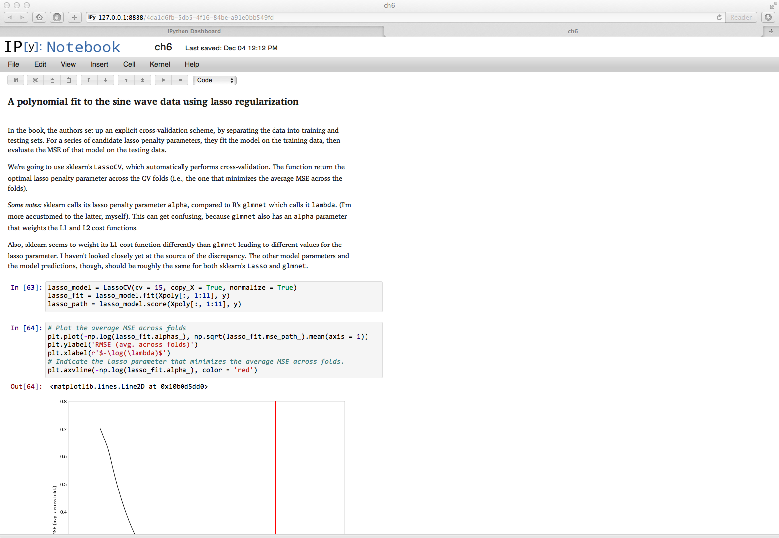
Here are before and after shots of these changes:
Fixing it (globally?)
So this is all cute right? And it’s nice that we can do some customizations to the notebook, but, you know, big deal.
I’d argue this is actually more important than just aesthetic tinkering. The IPython notebook is becoming a one-stop-shop for exploration, collaboration, publication, distribution, and replication in data analysis. Like I said above, I think it’s not unreasonable that notebooks could replace a large class of scientific papers. But to do that, it has to perform as well as all the fragmented tools that researchers are currently using. Otherwise, people are going to keep pasting their code and results into Word and Latex documents. In other words, the notebook has to work not just as an interactive environment, but also as a static document. The IPython team realizes this, which is why tools like nbconvert exist.
People are doing amazing things in the notebook. The typography should encourage people to read them, and not just serve as suped-up comments.
Tools are often strongly associated with aesthetic characteristics that are only peripheral to the tool itself. ggplot can make charts that look however you want, but when people think of ggplot, they think of the gray background and the Color Brewer palette. And while main selling point of ggplot is its abstraction of the graph-making process, I think it was the distinctive and attractive style of its graphs that made it catch on so successfully. On the opposite end of the spectrum, when people think of Stata graphics, they think of this, and wince. And Latex will typeset documents with whatever crazy font you want, but in everyone’s mind, Latex ⇔ Computer Modern (for better or worse). Design defaults are important: they’re marketing and they encourage good habits by your users. It’d be a shame to have it be that people think of the IPython notebook and picture long lines of small, single-spaced Helvetica Neue.
It’s an insanely powerful tool. It’d be awesome if it were beautiful too, and that goal seems eminently do-able.


Comments